Essential steps for creating a visual brand
Essential steps for creating a visual brand
Here at My Own Stationery, we deal in customised notepads for businesses, so we've seen our fair share of effective (and not-so-effective) visual brands. For new start-ups just breaking into the market, and longer-established organisations deciding to revamp their image, creating a brand can be a fun but often confusing and difficult process. Seeing as your visual brand dictates the first impression many customers receive of your company, it’s important to ensure you hit the nail on the head. Though branding your business may seem daunting from square one, a methodical approach can make things so much easier. Here, we’ll guide you through the essential steps to creating your visual brand.
Get Drawing!
The first idea you have for your visual brand is rarely going to be the best, but when creating a brand from scratch, a rough brainstorming phase is necessary. The exact method you use for getting thoughts out in the open is completely down to you, but it’s important to establish a rough idea to guide the future course of your design. Spend a long time thinking about your business, your target market, and how you want your customers to think and feel when they encounter your brand. Then, try to translate this emotional and psychological vision into a set of visual cues that will resonate with you, and the persona of your brand. Finally, go searching for existing visual brands that exist within the same school you’re targeting. This can include your competitors, brands outside your niche, visual arts, and anything in between. This phase will get your inner designer working, and open your eyes to artistic styles and branding tactics you may not have considered before.
Understand Different Styles
Graphic design trends are constantly changing, but those companies that hit the nail on the head the first time rarely have to go to the trouble of rebranding at a later date. While there’s no real limits to what you can do with your aesthetic brand, there are several tried and tested styles that you may want to draw on. These include:
- Classic: Think brands like Budweiser, Coca-Cola, and Krispy Kreme. Although new graphic design trends are fresh, exciting, and sometimes beautiful, they frequently become outdated in the space of a few years. If you’re able to pin down a design that’s truly timeless, you’ll give your brand excellent staying power, and the potential to reach an exceptionally wide audience.
- Material: This style was invented by Google, and picked up by countless online brands afterwards. Riding on the development of flat design, material branding makes use of shadow and grids to create a distinctly modern look. This is generally a safe option for businesses solely in the online space, or those whose brand is a part of many online properties.
- Handcrafted: A fairly new trend, these brands have logos and graphics that look like they’ve been hand-drawn, or made using arts and craft materials. Though there are only certain niches this works with, usually in the food and drinks sector, it’s certainly worth considering if it fits with your brand persona. We feel a handcrafted brand image works particularly well with our custom business notepads.
- Minimalist: Apple spearheaded the rise of minimalist branding in the late nineties and early noughties. Easy and versatile, this kind of branding relies on simple, yet recognisable designs. Minimalist branding allows for future growth, and works for almost any kind of business.
Remember that while these are the most common design styles in the modern business arena, there’s much more to explore and experiment with.
Make it Yours
After enough research, you’ll narrow down a select few brands that stand out and capture your imagination. While borrowing ideas from what’s been done before is a part of any creative process, it’s essential to make sure you keep your brand original, and avoid straying too close to any established brands. It’s fine to be inspired, not so much to be a shameless copycat. While keeping within the conventions of one of a certain design style, your visual materials should be unique enough to identify your business, without causing your target audience to think of another brand, especially if that brand is a direct competitor. If you’re selling high-end jewellery, for example, and all your competitors are using elegant, handcrafted logos with a cursive font, you’ll need to strain away from this template. This could mean going for something completely different, like a minimalist logo with plenty of white space, or a small, but striking change. For instance, if all your competitors had colour schemes that were heavy on black, going for a deep navy or a rich purple can set you apart, while still capturing the same sense of high quality, luxury, and professionalism. As you’ll soon discover, finding the right balance between inspiration and emulation is tough, but it’s still an important step you need to take.
Get it Fit for Every Format
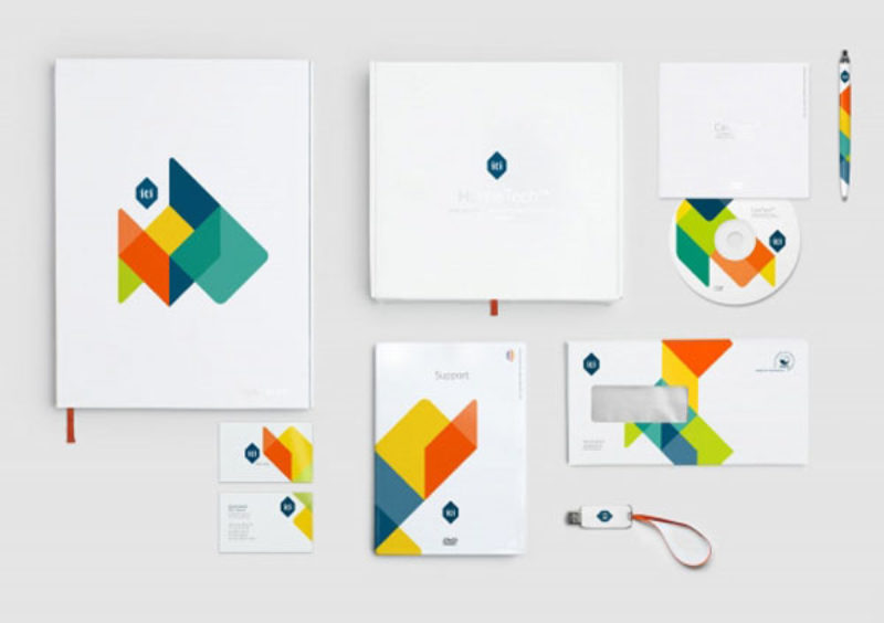
Now that your idea is beginning to take shape, it’s time to get it ready to show the world. With the wide range of digital platforms you can use to place your brand, along with traditional formats like storefronts, business cards, notebooks and brochures, you need to consider the whole spectrum of bodies your brand can take on. Consider your website and social media profiles, advertisements both online and in print, along with business cards, branded notepads, pens, and anything else you’ll be handing out at trade shows. When picking out colours, logos, and fonts, you need to ensure you can keep your brand consistent across all the channels where you’ll be presenting it. If you’re primarily an online business, and customers will be spending long periods of time on your website, it may be wise to go for a neutral, easy-on-the-eyes colour scheme. Common design pain points such as white space and pronounced edges can grow even more problematic when you have to brand social media banners and other tricky formats. Obviously, there’s no problem with a bit of variance if a certain graphic looks great on a business card but terrible on an online banner ad. However, it’s essential to ensure a certain degree of consistency in all your aesthetic branding if you want it to be effective.
If you're interested in learning more about our customised notebooks for your business or brand, get in touch with us at My Own Stationery today.
Recent Articles
Hardback Book
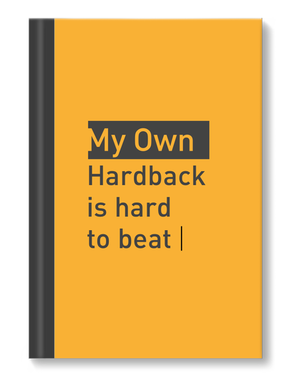
Create customised covers for your hardback notebooks with My Own Stationery. Our hardback notebooks are available in casebound or wirebound, A4 & A5 sizes, with your choice of 8mm lined or blank pages for wirebound and 8mm lined for casebound, both with a high-gloss finish. Create your own unique cover by uploading your completed design, or design your front and back covers using our online design builder.
Softback Book
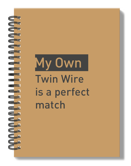
Our customisable cover softback notebooks are available in wirebound style, with a choice of sizes, number of pages, and either high-quality lined or blank paper. Depending on the type of book you choose, you have the option to upload your professional design or custom design the front & back cover in our online design builder.
Refill Pad
Customise an A4 Refill Pad cover with your own brand using our online design builder at My Own Stationery, choose between uploading a completed professional design or design your own using our online design builder. Our A4 Refill Pads are made with high-quality paper to ensure your design is as unique as your brand.

